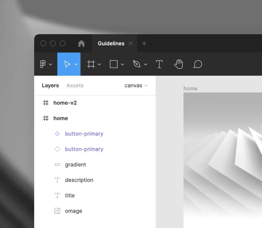
Libraries & Components
Component libraries, think of them as a LEGO box to build interfaces. They make it easy to reuse design elements and keep consistency throughout the design of a product.
Components
Components are building blocks to create an interface and are similar to how you use them in code. A component is indicated with a purple color and a diamond shape.

A Main component (4 little diamond shapes) is the source and when you edit it, it will also update all instances (outlined diamond shape) of the component.
Insert a component
To use a component you go to Assets or press SHIFT + I to quickly view all available components, you can drag it to your page to start using or editing it.
Switch a component
If you want to change your component to something else, select it and go to the component dropdown in the properties panel. Here you will see a list of all available components.
Variants
Components can have multiple variants. This is used to set a different state (e.g. hover, pressed down, focus, ...) or to include an icon or not.
To choose a different variant, you select the instance of your component in the properties panel you will see all available options.
Styles
When using typography, colors or effects (shadows, blur, ...) we always make sure they are defined as styles. This will result in a cleaner use of color and text sized and will avoid ending up with 50 shades of grey.
You can add a style to any element by clicking the 4 circles square icon in the property panel. After clicking it you will see all available styles, this works for Text, Fill, Stroke and Effects.
Libraries
Any Figma file with components or styles can be published as a library and can be used in different files.
You can see which libraries are linked to a file by going to Assets. If you want to link a new library you select the library icon and you can enable any library available in the list. After linking a library you can use all published components and styles from that library.
Documentation
We try to include documentation for each component inside of the component library to give some more context on how it should be used and the available variants.
To view the documentation, you can select a component on screen and in the inspect panel you will see extra information about the component and/or a link to the documentation (if available). The documentation can be any URL for example to a Design System website or Storybook inventory.
If you click the icon next to the component name, you will open the source of the component. Here you can find all variants of the component and extra documentation.